Three inspirational layouts I have found are all from Miamiliving magazine. These layouts are very eye catching and pleasing to the reader.


Three inspirational layouts I have found are all from Miamiliving magazine. These layouts are very eye catching and pleasing to the reader.
Color schemes:
 This palette of oranges represents the warmth and sun of Miami.
  These colors represent Miami’s well known night life.
Name: Miami Life
Two similar publications:
Miami Living Magazine: provides information for travelers and visitors of Miami Beach. This magazine directs its readers to the best Miami has to offer.

The University of Miami Magazine: catches you up on the latest news. Each issue has different main subjects.

City/Regional Magazine
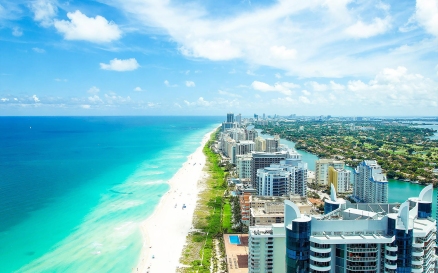
In this magazine I will be exploring and discussing Miami. I will have pictures of major landmarks, show a map, and tell you why Miami is a great place to visit. I will also discuss all the different places there are to have fun and eat.
Arial is a typeface that is simple. It is an eye pleaser because of its legibility and simplicity. There are several attributes to arial such as bold, italic, regular, and bold italic. Arial has two designers (Robin Nicholas, Patricia Saunders) and three classifications (Grotesque Sans, Monospaced, Condensed)
Arial’s personality is sweet and simple. It allows us to easily read it and it is good for long texts. It is legible and pleasing to the eye. Arial is a favorite to writing essays and long stories. It helps the reader easily read the entire text because of its simplicity.
Arial’s classification is neo-grotesque sans- serif. I visually like the baseline and bowl of the a in this typeface. I like how this typeface is simple. It is visually accommodating and easy to read. 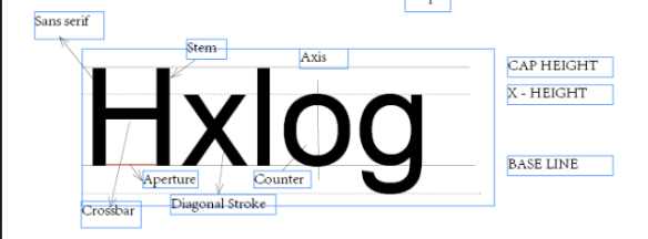
Week 3-
Arial has many different families of typefaces. With all the different attributes to the font there are many different ways it can be used. This font is successfully used in text setting reports, presentations, magazines, essays, displays in newspapers, advertising, and so much more.

Week 2– Typeface Arial
Designers: Robin Nicholas, Patricia Saunders
Foundries: Microsoft Corporation, Monotype
Classification: Grotesque Sans, Monospaced, Condensed
Robin Nicholas was born in Kent, England, in 1947. He worked with typefaces and fonts for most of his adulthood. Nicholas became the manager for the Type Drawing Office. He is currently working at the Monotype Imaging in the UK as the head of typography.
Patricia Saunders was born in England as well. In 1951 she began working at the Monotype Drawing Studio. She was involved in an assortment of fonts for Monotype typesetting machines in lead and phototypesetting.
